Capture SDK
About the project
One capture flow that works on the simplest feature phone in the room #
Smile ID verifies identities for banks, telcos and fintechs across Africa. Most of that volume arrives through mobile SDKs that partners embed in their own apps. This is the story of one release: what v11 got right, what partners told us it got wrong, and how v12 answered.
- Role
- Senior Product Designer. Capture UX, instruction system, copy, design tokens, handoff
- Platforms
- iOS, Android, React Native, Expo and Flutter SDKs
- Scope
- Selfie and document capture, instruction screens, do and do not guidance, partner theming
- Note
- Internal metrics are under NDA. Impact is described through decisions and adoption.
Good enough to carry a third of the volume, and text-heavy #
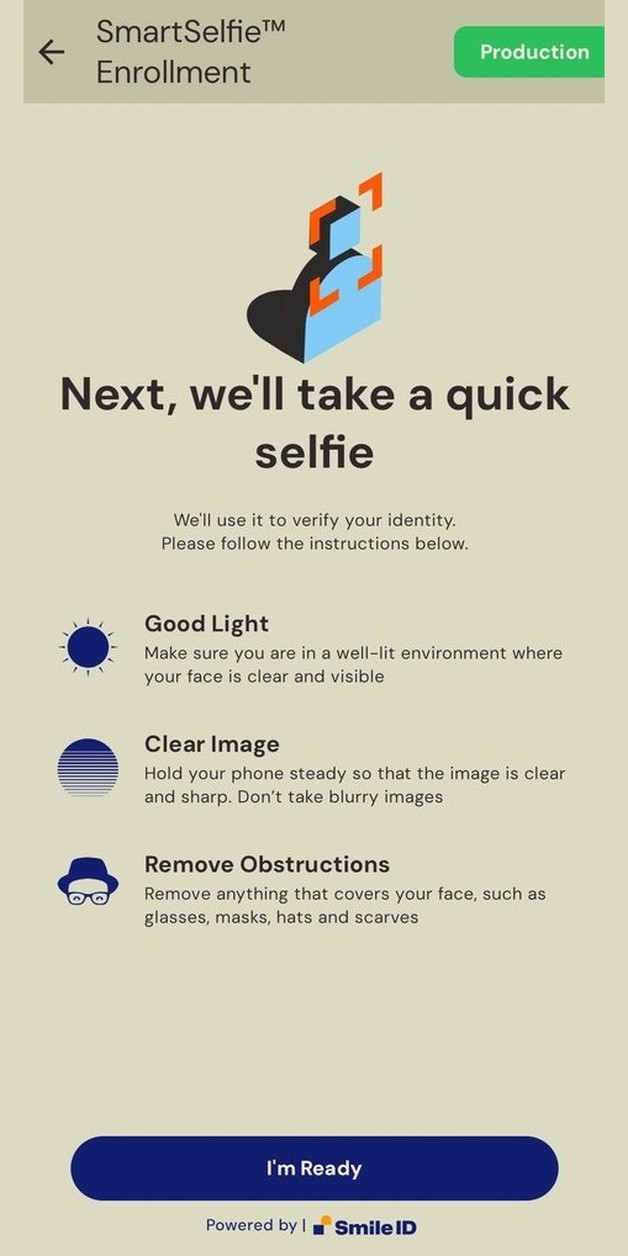
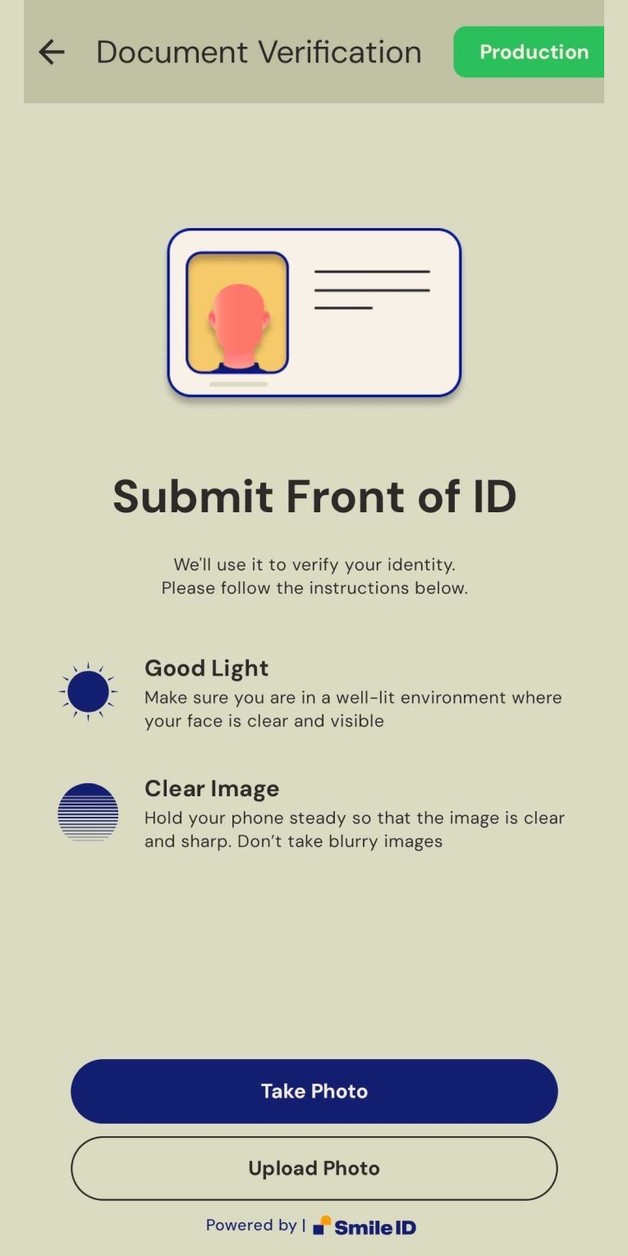
v11 was the release that made the SDK the main road into Smile ID. It explained each step with an icon and a sentence, it added the first security checks, and partners trusted it with almost a third of all verifications.
It also had a ceiling. Every instruction was a paragraph. Good light, clear image, remove obstructions, each one a heading with two lines under it, on a screen that a first-time user sees once, in a hurry, in their second or third language.
The same three complaints, in their own words #
The brief for v12 did not come from a workshop. It came from partner channels and our own support queue, and three messages said it all.
- Partner, document verification
“Our SDK experience feels too text-heavy for a lot of our customers, many of whom are not very literate. Customers are misreading or skipping the text prompts and end up submitting the wrong images.”
- Partner, mobile team
“The image hints for guiding the user are too small on mobile devices and seem unreadable. Is there a way to make the images and text below them larger?”
- Partner, growth team
“We are experiencing some drop offs once the user enters the flow. We have no way of telling what caused the drop off or where the user dropped off.”
What that feedback became #
Each complaint mapped to one bet. Together they set the scope for v12, and they were chosen so that a partner could feel each one without reading release notes.
- 01
Better user interface
Illustrated instructions instead of paragraphs, automatic light and dark variants, partner fonts, button and card shapes, and consent screens that carry the partner's brand.
- 02
Better developer experience
Localisation out of the box, built-in crash reporting, and image compression that keeps submissions inside upload limits on slow networks.
- 03
Better risk signals
Richer device and capture signals collected during the flow, so fraud gets harder to pass while an honest person notices nothing.
Show, do not tell #
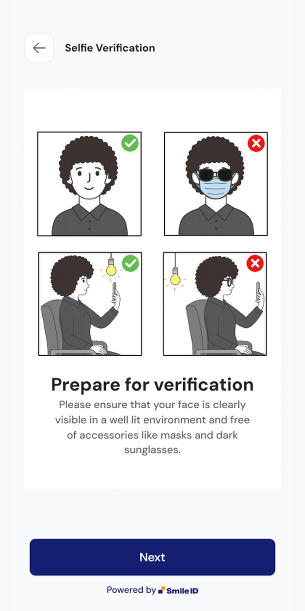
The first serious iteration replaced the paragraph with four illustrated do and do not cards. A green check or a red cross carries the judgment, so the state is read at a glance before a single word. One action on screen: Next.
Testing it exposed the next problem. The cards were right, but they sat below the fold on small phones and the person still had to work out where to stand. The instruction and the capture were two separate ideas on two separate screens.
Understood without reading #
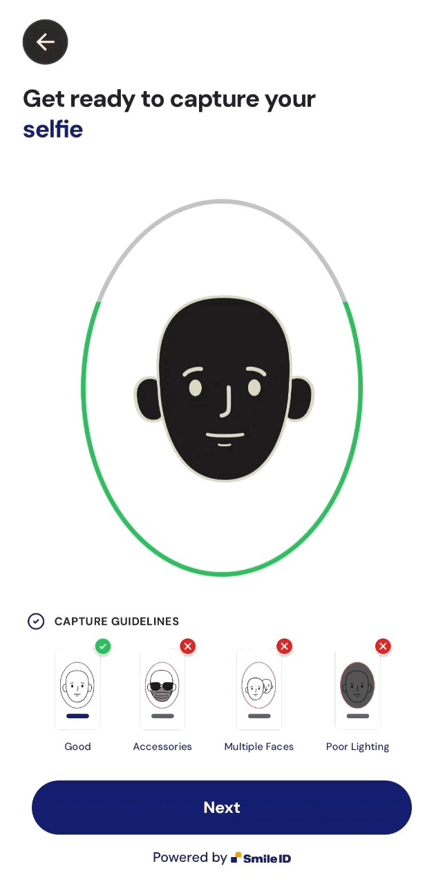
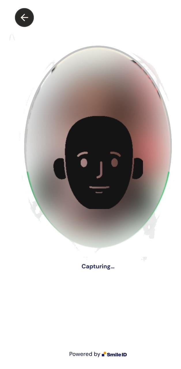
The final v12 screen assumes nothing about literacy. A face inside an oval shows you where to stand. Four thumbnails show good and bad capture. Colour does the judging: green means yes, red means no. Then the capture screen uses the same oval, so nothing has to be learned twice.
- Neutral illustrations that travel. The figures are deliberately neutral in skin, hair and dress, so one flow ships into every new market without carrying a bias about who the user looks like.
- Strings are data. Every piece of copy became a keyed string with room to grow. I tested the longest translations against the tightest layouts before handoff so nothing wrapped into the camera view.
- Coach, do not judge. The oval carries state through colour, stroke and motion, designed against WCAG contrast and colour-blindness rules so "almost there" never depends on hue alone. Copy says what happened and what to do next. It never says the person failed.
If you cannot read a word on the screen, it still works. That is what it takes to verify the next five hundred million people.
What changed #
Numbers stay inside Smile ID. What I can say:
- v12 shipped across iOS, Android, React Native, Expo and Flutter from one design and one token set, with partner theming applied through tokens rather than forks.
- The SDK line remained the main way verifications reach the platform, ahead of the web and API routes, and v12 is the version partners are migrated to.
- v12 is the flow demonstrated company-wide as the reference end-user experience, and the illustration and instruction system became the standard for every new capture step.
The best compliment for a capture flow is that nobody remembers it.