AML Monitoring
About the project
A screening screen an analyst can read in seconds #
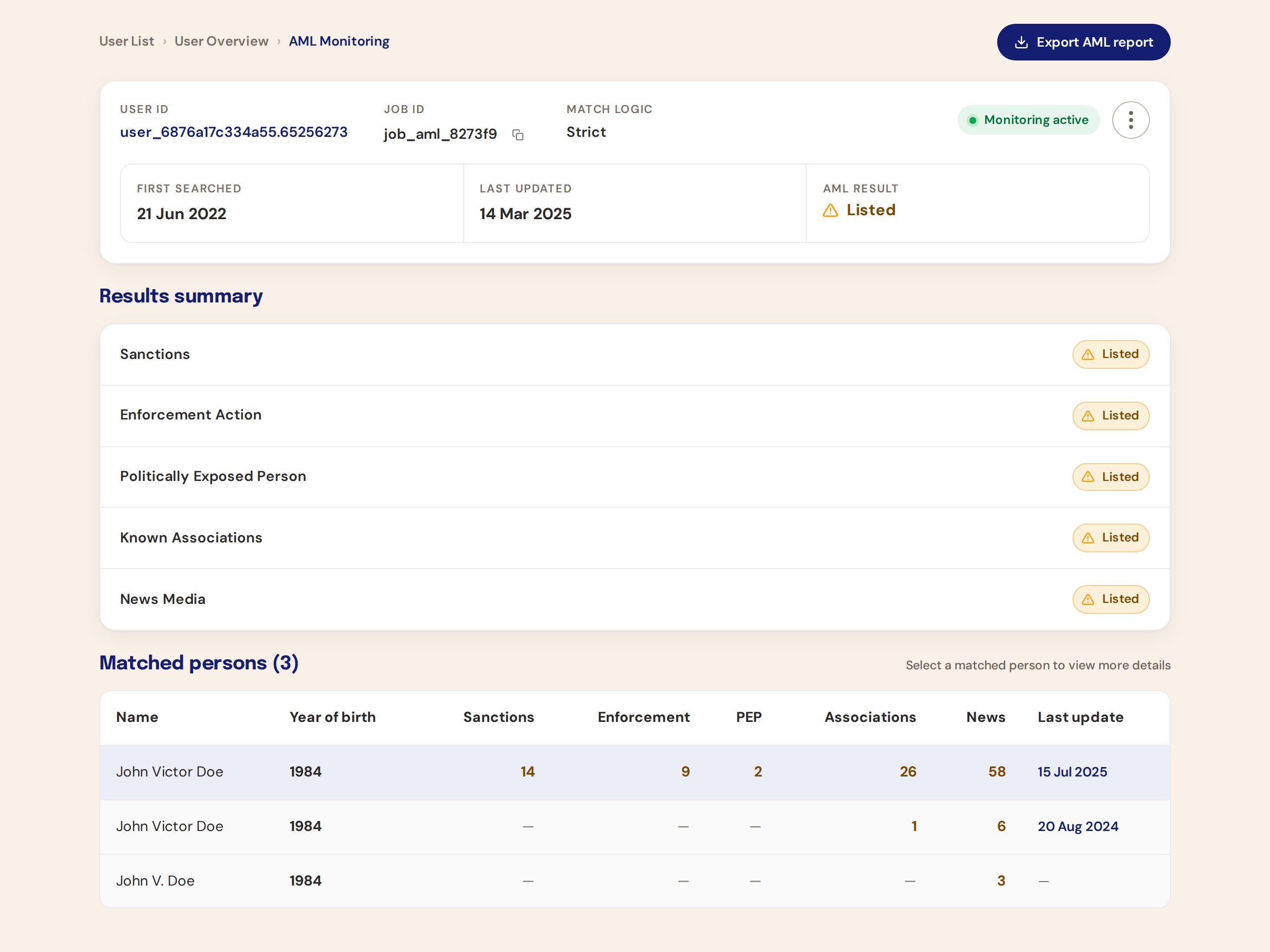
Anti-money-laundering monitoring returns a list of possible matches for one person, each with sanctions, PEP and adverse-media indicators. The old overview buried the answer. I rebuilt it around what the API actually returns and what the analyst actually does next.
- Role
- Senior Product Designer. Research, IA, prototype, tokens, Figma handoff
- Surface
- B2B web portal, desktop first
- Method
- HTML prototype grounded in the API schema, then Figma with variables and a wired prototype
- Status
- Design complete and handed over
The result was there. Nobody could find it. #
An AML job produces one result for the person being screened and a list of matched persons, each with their own indicators, aliases, history and news. The old page flattened all of that into one long scroll. Analysts scrolled, lost the job-level verdict, and could not tell which match mattered.
Compliance work is about acting quickly on the right record. A screen that hides the record is a compliance risk, not a styling issue.
The response schema was the brief #
I started with the /v1/aml response rather than a moodboard. Every element on the screen maps to a field, and every field that mattered to an analyst got a place.
- The job-level result stays in the header. Whatever the analyst is looking at, the verdict for the screened person is always visible.
- Matched persons are a ranked, selectable table. Per-person indicators sit in the row. Sorting by relevance is the default.
- History is scoped to the selected person. No more mixing timelines from five different matches.
- News shows category counts first. The API returns counts per category; articles load on demand through a second call, so the overview stays fast and scannable.
- Fill means status or action. Text means data. A consistent rule that lets colour do one job.
Choosing the drawer #
The hard question was how to show one person in depth without losing the list. I built five working layouts as separate HTML files and reviewed them with real response data: inline expansion, a quick-view modal, a right-hand drawer, and two split-rail variants for three and ten matches.
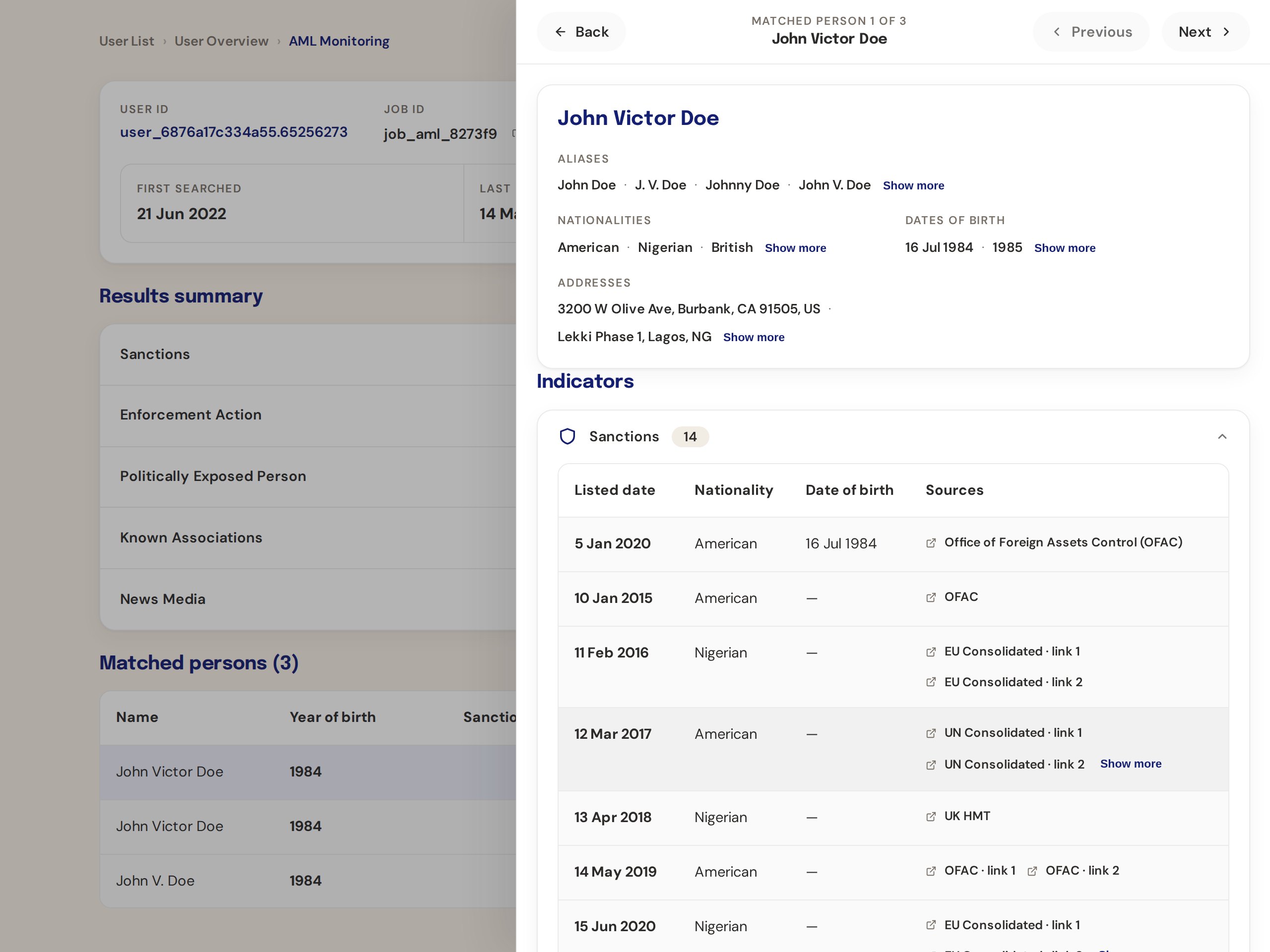
The drawer won. It keeps the ranked table in view, gives one person a full column, and supports stepping to the previous and next match without closing anything.
- 01
Inline expansion
Opens the match in place. Cheap to build, but one open row pushes every other match out of view.
- 02
Quick-view modal
A fast peek at one person. Hides the ranked list entirely, so comparing two matches means closing and reopening.
- 03 · Chosen
Right-hand drawer
Keeps the ranked table in view, gives one person a full column, and steps to the previous or next match without closing.
- 04
Split rail, three people
Good for the common case of a handful of matches. Breaks the moment a name returns ten.
- 05
Split rail, ten people
Scales the rail, but the detail column shrinks until the indicators no longer fit on one line.
The decisions inside the drawer #
- Back and a person-name header with Previous and Next, names shown as tooltips so the header stays short.
- Indicators and change history merged into one view. Tabs hid information analysts needed side by side.
- Aliases on their own row, first. Matching on a known alias is often the whole story.
- History scales. Year bands, the latest ten entries, and a Show-all expander for the rare long record.
- News articles as a Date and Article table with hyperlinked titles and Load-more paging that maps to the paginated endpoint.
- User ID as a link, Job ID with a copy icon. The two things analysts move between systems most often.
- A careful disable-monitoring dialog. "Continuous screening of this user will stop and cannot be enabled again." No reason field, and the safe choice keeps focus.
Built on the design system, then wired for engineering #
Headings in Epilogue, tables in DM Sans, feedback and neutral colours from the shared token set, and a table spec that now applies to every Smile ID surface: white header, uniform body rows, horizontal dividers only, hierarchy through colour and position rather than weight, rows tall enough to hit.
The final design lives in the team's working Figma file on its own page, consuming the file's theme variables (four modes, including dark) and its existing button and badge components. The prototype is wired end to end: rows open the drawer as an overlay, Previous and Next step through people, and the news table swaps in place.
A prototype that behaves like the product removes most of the questions from handoff.